That first poster was strangely static. A bare-chested male hero, holding some kind of shining light or torch above his head; a woman, with one leg provocatively unclothed, below him. She has a ray gun, but it is hanging flaccidly at her side; the hero is holding his weapon or wand or magic lamp aloft, dividing the frame into quarters.
They aren't identifiable as the film characters: either Mark Hamill and Carrie Fisher hadn't been cast when it was painted, or else the artist (one Tom Jung) didn't have reference material to hand.
They are standing on a sandbank. It could be Tatooine, but Leia doesn't go to Tatooine in the film. And apart from a brief training sequence on the Falcon, Luke never actually wields his lightsaber. (And anyway a lightsaber is a short coloured beam, not a silvery beacon that reaches up to the sky.) The droids and the cloud of X-Wing fighters -- far more than appear in the film -- are small and indistinct.
Behind everything an imposing, ethereal face. It could be a man in a helmet; it could be a robot. His blackness merges with the blackness of the stars. There is no clue as to who he is; but he dominates the frame: at some level, he is what this movie is about.
The poster is selling us a film which is alien and Other; wistful and slightly exotic. It's a science fiction film -- there are robots and spaceships and ray guns and some kind of space station -- but they are part of the background; not the selling point. We are focussed on a hero and a heroine who look as if they came off a Frank Frazetta sword-and-sorcery paperback cover.
A long time ago in a galaxy far, far away. We are intrigued, rather than thrilled. If the poster had a soundtrack, it would be Leia's theme or the Stravinsky-inspired Tusken music.
If the second poster had had a sound track, it would have been the Twentieth Century Fox fanfare, or perhaps the Imperial March Track 15, the Last Battle. It is safe and familiar, a group of comrades on an adventure. Where the first was static, this one is full of action. There is a cast of thousands, including recognisable stars like Alec Guiness and Peter Cushing. The hero and the heroine are identifiable as Hamill and Fisher, and they are fully clothed.
Luke, at the front, points his blaster directly at us; Leia, behind him, is in an active combat pose. Han is behind her, firing a blaster in the other direction. The first poster was neatly split in three by Luke's mysterious flaming sword; this one is split by blaster bolts, zapping out of the frame at jaunty angles. The X-Wings have go faster rockets blasting out of their rears; they are chased by overwhelming numbers of TIE fighters. The other poster was located on Tatooine; this shows the characters suspended in space, against a starry backdrop.
Darth Vader again dominates the picture; but he's no longer a disembodied face. He stands behind the main group, towering above them. He is holding a sword like weapon. The beam is much like the beams from the hero's ray-guns. We may not yet know that the tool hanging between Luke's legs is called a lightsaber but we can hardly fail to spot its phallic significance. But it's that intriguing laser sword which dominates the picture. The bad guy is a knight from an older world: the hero is a contemporary space cowboy.
Most of us knew Star Wars as a comic before we had seen the film. Howard Chaykin's cover has the same vibe as the second poster. A dynamic group of heroic figures, facing the reader. An abstract image which doesn't represent anything which happens in the story -- Leia and Ben are never in the same room -- but which incapsulates the movie.
Luke is still facing the reader, but he now has a lightsaber, not a gun. Ben is now behind him, and it's his lightsaber beam which shoots out of the right of the fame. Han is still on Luke's left, firing his blaster. Leia is behind them, weirdly aloof. Two X-Wings are flying towards us; they could even be threatening the group.
Where the two film posters showed a very small Death Star in the top left hand corner, the comic book makes it dominate the picture, framing the group. Either we see it in the moment of its destruction, or else it is supposed to be eclipsing the sun. (The darkness blocking out the light: the movies didn't get to that symbolism until the Force Awakens.)
And behind the four heroes, again, is an enlarged face of Darth Vader shaded, bizarrely, in green. Green is an easier colour to deal with in cheap four colour printing that black and white. Just ask the Hulk.
Now: fast forward to September 1978.
Star Wars is a very long time in the past; the Empire Strikes Back is a very long time in the future. Time passed slowly in the 1970s. Battlestar Galactica has just started on TV, if you are that desperate.
Run your eyes along the "spinner" at your "drug store", or the import section in the basement of Dark They Were And Golden Eyed. Marvel has launched a new comic book. (They've been trailing it for several months.) Have a look at the cover. And experience a brief, agreeable moment of deja-vu?
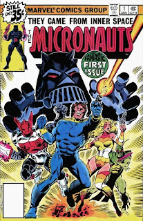
An heroic, musclebound figure in a blue jump suit. A generic Marvel tough guy. Paint a skull on his chest and he could pass for the Punisher. But he's firing a ray gun out of the panel: like Luke Skywalker. Stan Lee doesn't wholly approve of ray-guns, but since Star Wars arguably saved the company from bankruptcy, his attitude has softened.
Behind him, fanned out at roughly 45 degrees; are three other characters. A girl, in a colourful, sprayed on bikini, also with a ray gun. An alien, wielding something which could be a spear. And a medieval knight, red and white armour, with a sword. It's a metal sword, not a lightsaber, but it glows with some kind of energy. The girl hides behind the hero; the alien hides behind the girl. The knight stands behind the hero, but he's clearly advancing.
The group are surrounded by motion lines: there is a small outbreak of Kirby Krackle at their feet.
And behind them all, in a black helmet, horned like the Devil, a figure in black. His mouth, covered by something which could be a grate or a portcullis; as if his face were a piece of gothic architecture. His hands, held up, detached from his body as if grabbing the heroes. A venerable comic book motif, this. Kriby used it on the cover of Fantastic Four #49. Chris Achilléos did a homage on the cover of the novelisation of The Three Doctors. We don't know who he is, but he's clearly not a goodie.
A hero.
A space-knight.
A princess.
An alien.
Blaster swords.
Laser fire.
And behind it all, a dark lord.
It was very, very clear what was on offer.
I have been saying for some time that I would talk about Bill Mantlo and the Micronauts.
So this is Andrew Rilstone, talking about Bill Mantlo and the Micronauts.
The Micronauts: best and most blatant and shameless of all Star Wars rip-offs.
The Micronauts: the best bad comic book I have ever read.
continues
I've been planning to write about Micronauts for several years, and I hope I have said most of what I wanted to say.
As ever: I am trying to make part of my living writing niche stuff which interests me, and if you think it is worth reading, it would be incredibly cool if you either subscribed to my Patreon (pledging $1 per short article) or bought me a metaphorical cup of coffee on Ko-Fi.
With the effective demise of Twitter, it's increasingly difficult for micro-journalists to promote their work, so if you have found this, or any of my other material, in anyway interesting, please do mention it to your online communities.


The Empire March wasn’t written until Empire Strikes Back
ReplyDeleteFair point, succinctly made :)
ReplyDeleteThe world would be a better place with a lot less Star Wars and a lot more cheap knockoffs of Star Wars.
ReplyDeleteThe same goes for Star Trek and Doctor Who.
Also: Bill Mantlo wrote an article in The Comics Journal before Micronauts came out describing the development of the comic. (Imagine a time when TCJ would run a piece about Micronauts!) He was sent a box of the toys and given no other instruction or guidelines. That kind of freedom from corporate management would be unthinkable today.
Just how cheap can a Doctor Who knock off get? It'd put Blake's 7 to shame for cheapness.
DeleteDo you have a link or scan of that? (Next piece is about where the comic came from, but I'm working from the text pieces in the comic itself.)
ReplyDeleteYep! It turns out someone scanned and posted it:
ReplyDeletehttp://starlogged.blogspot.com/2013/07/1978-bill-mantlo-on-micronauts.html
This is a transcription of Mantlo's article:
ReplyDelete- https://innerspaceonline.com/CJ40.htm
Thank you so much!
ReplyDeleteThis may cause my long procrastinated essay to become even more procrastinated, but I would like to get these things right.
Andrew
Doctor Who and Blakes 7 were both relatively expensive shows by the standards of their day. If you want to see a cheap 70s show, look at the Tomorrow People.
ReplyDeleteSomeone on the Twitsphere remarked the other day that British TV was like expensive theatre, where American TV was like cheap movies. I think that puts it rather well.